This project began by simplifying everything—the layout, the navigation, the user paths.
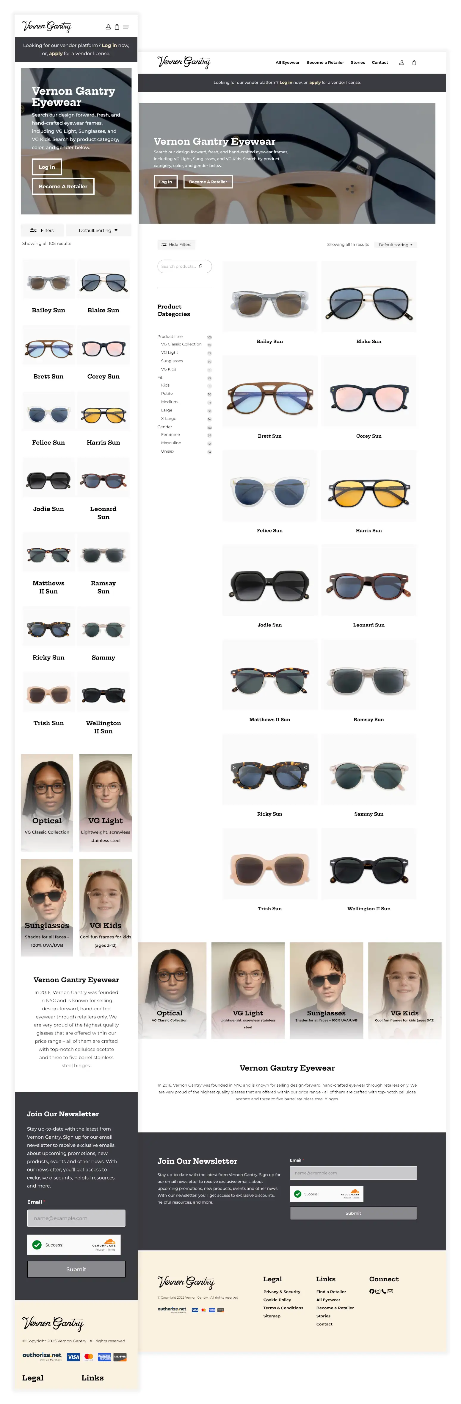
We redesigned the Vernon Gantry website from the ground up with the goal of making ordering eyewear feel effortless. The previous platform was full of friction: slow load times, redundant steps, and a poor mobile experience. We flipped the experience on its head.
From landing to checkout, every aspect of the user journey was reconsidered to support ease of use and repeat visits. Clear calls-to-action, a streamlined navigation structure, and intuitive filtering allow B2B customers to find exactly what they need—fast.
What We Did
Digital Strategy
UI/UX Design
Web Design
Branding
Responsive Web Development
eCommerce Integration
Authorize.net Setup
Server Setup & Management
Photography Direction & Editing
SEO Strategy
Platforms Used
WordPress
WooCommerce
Figma
Adobe Illustrator
Adobe Photoshop
Google Analytics & Tag Manager
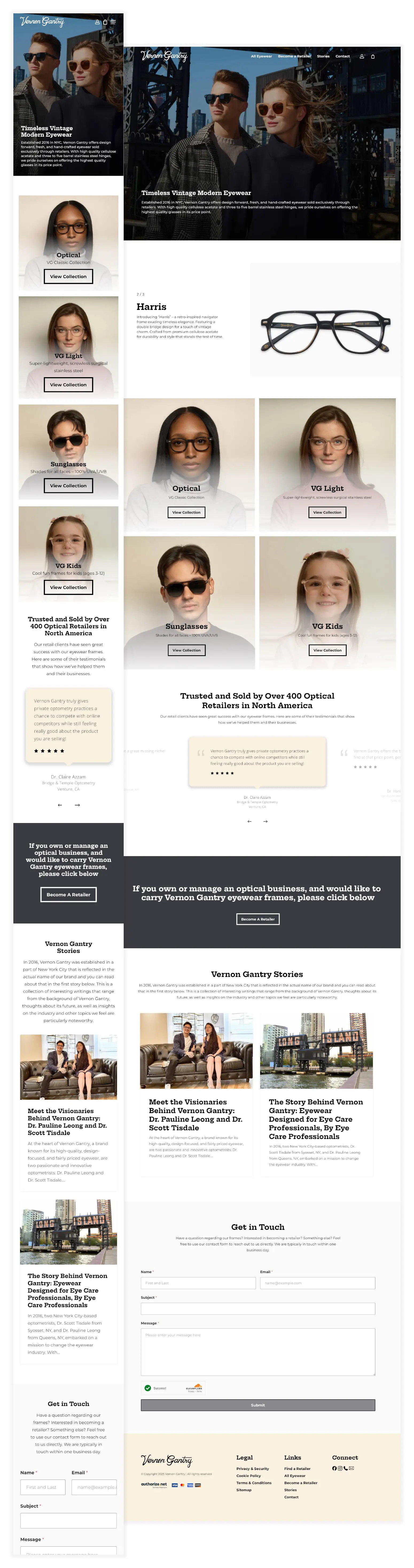
Clean, Minimal Brand Styling for a Modern Audience
While the Vernon Gantry logo remained untouched, we introduced a refreshed digital identity to better reflect the quality of their product and the simplicity of their user experience. We developed a modern, minimal design system rooted in clean typography, neutral tones, and a flexible layout grid. The site design reinforces the premium yet practical positioning of the brand—polished without being precious.
Icon and logo
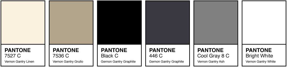
New color palette combination
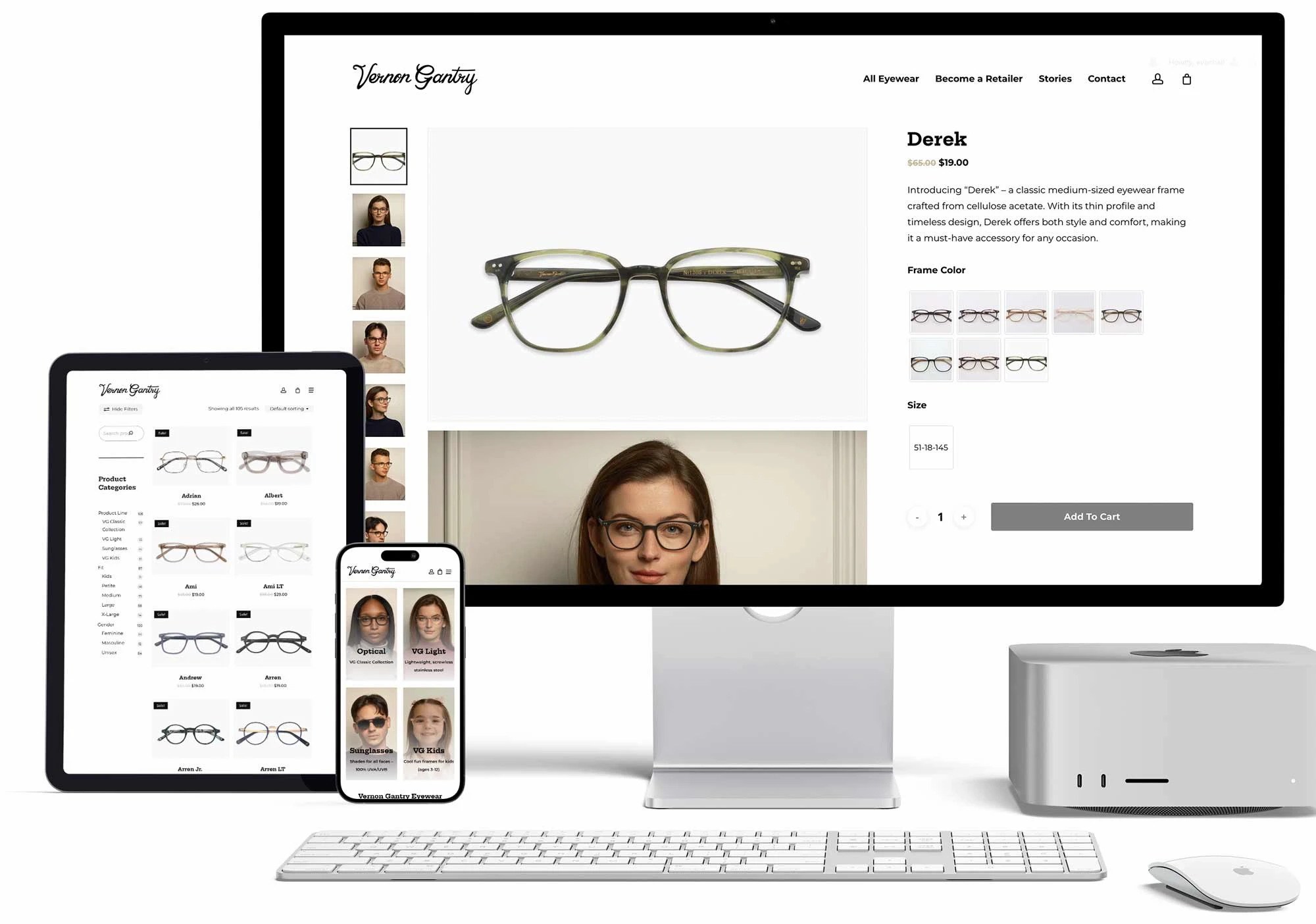
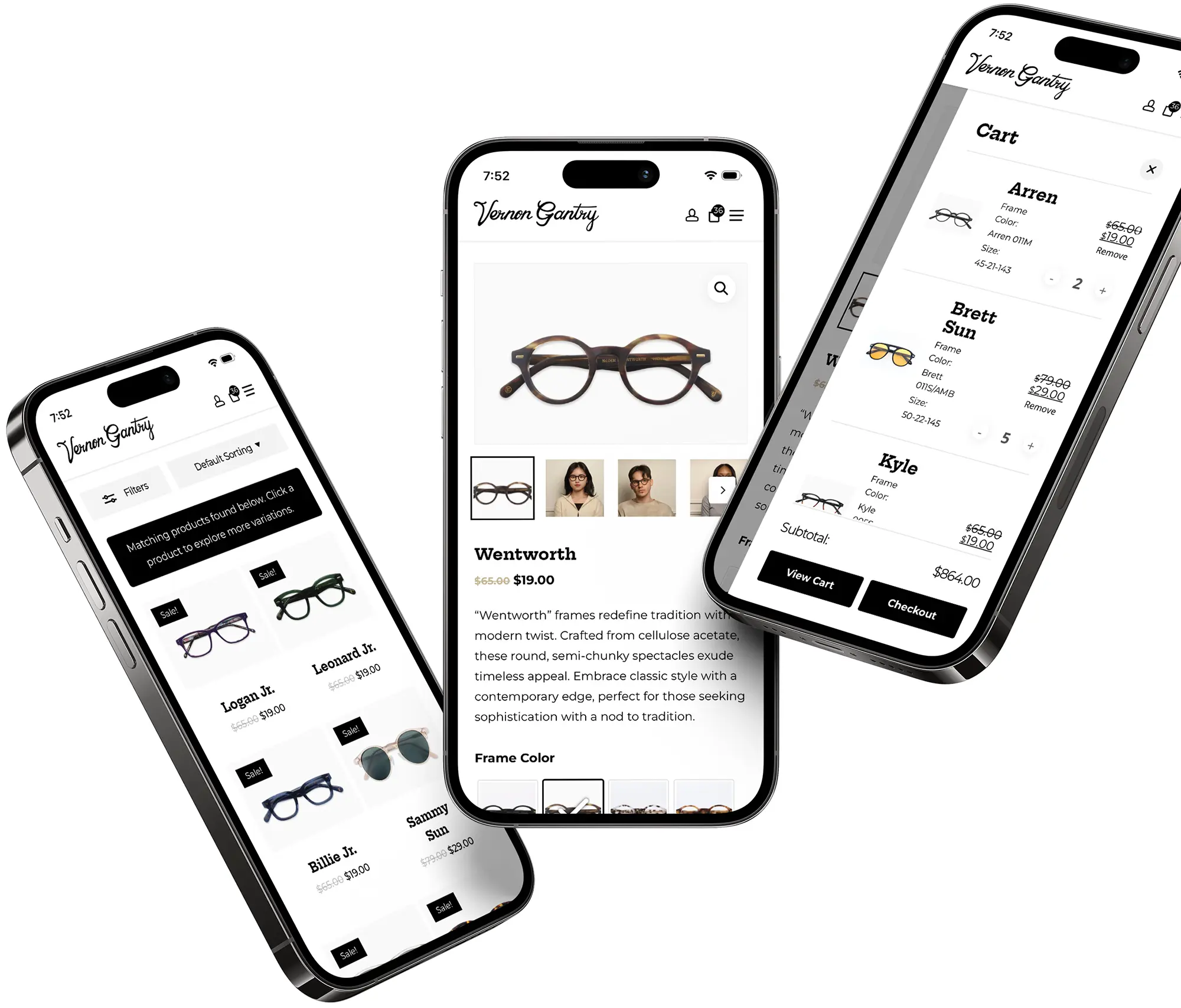
Ecommerce Platform with Smart Search & PDPs
We built a custom WooCommerce experience tailored to Vernon Gantry’s B2B needs, with intuitive product pages and smart filtering.
Optometry professionals can now search by SKU, size, or color code and instantly find matching products—no guesswork, no friction.
The result: faster, easier, and far more reliable ordering.
Verified Access & Account Management
To support Vernon Gantry’s pro-only model, we built a custom registration flow with account approval and full catalog access for verified users.
Each client gets a secure dashboard to manage orders, shipping, and billing. Authorize.net integration enables encrypted payments and stored cards for faster reordering.
Let’s Work Together
Pexl works with companies like yours to create memorable brands and websites that drastically improve your key performance indicators, allowing you to display your brand proudly.
Logo Refresh
When touching on the topic of overhaul vs. refresh, the initial JGR logo had been around for decades. It was created by an original founder of the company and represented a long history of success. We retained similarity in the original logo by implementing modernity and cleanliness, as well as negative space.

New logo and icon
Old logo and icon
White Space + Color
We harnessed the beauty of white space and color, both in photography and palette, to build a brand style for JGR. This combination was superb in letting brand fonts, color, and whitespace surround beautiful photography as the centerpiece.

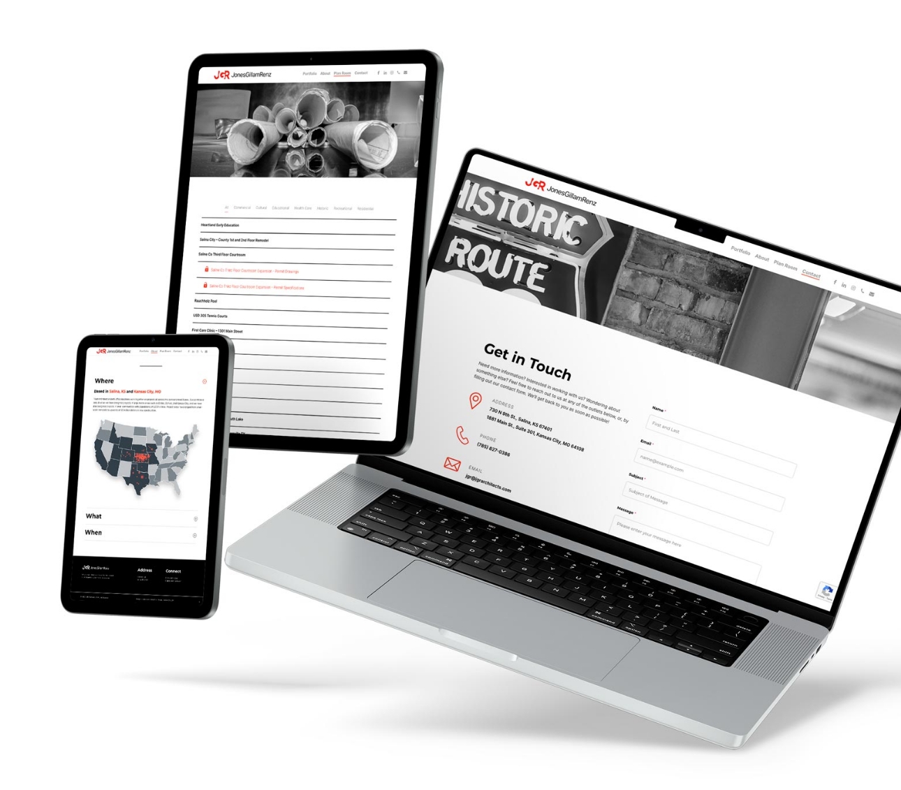
More Than a Portfolio
JGR has many uses for their website outside of showcasing their work. They also share plans with existing clients, as well as a detailed history of their company, the values they live by, and their employees.