
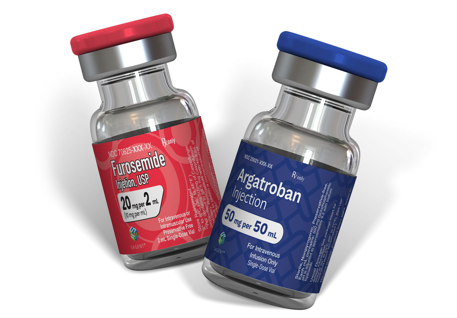
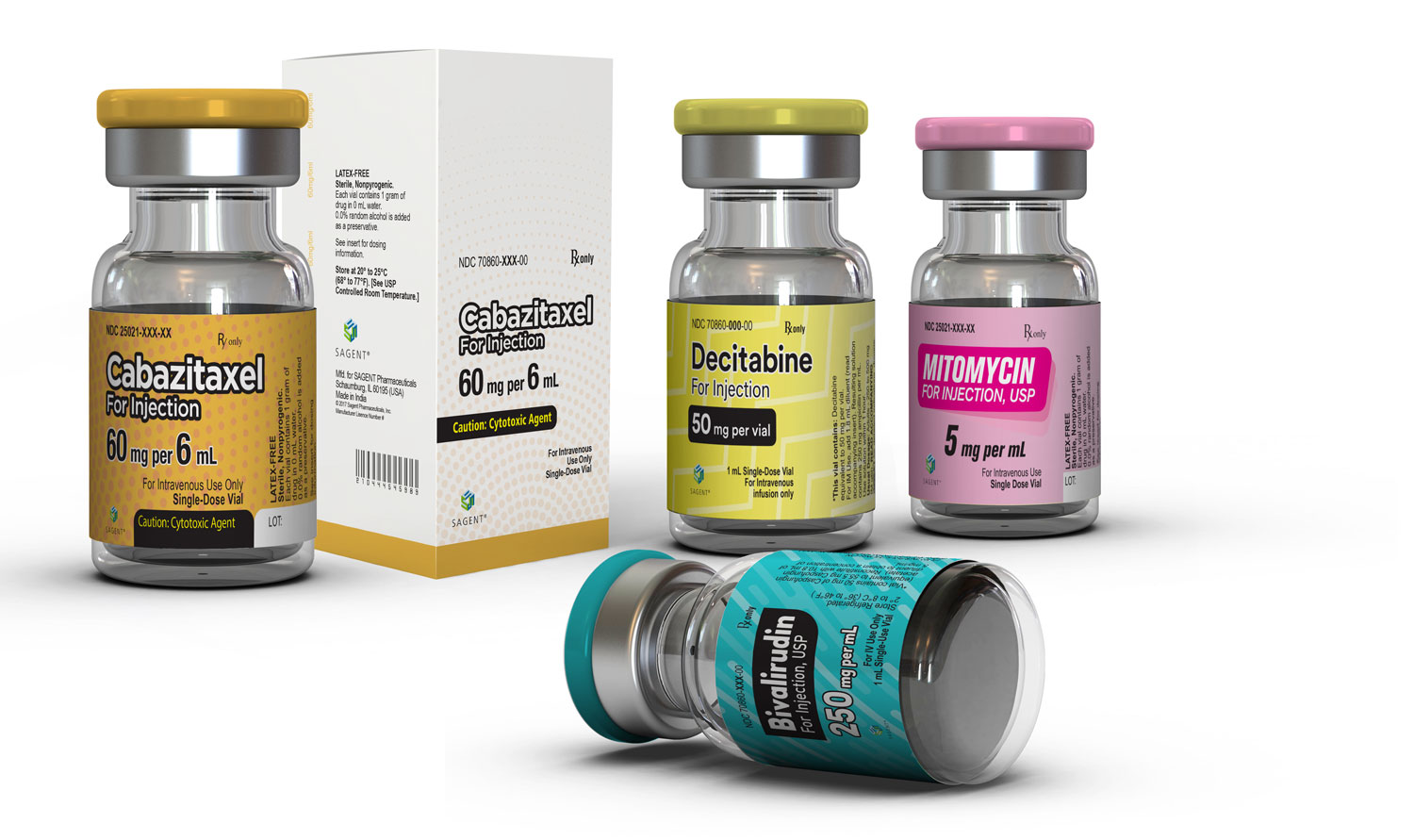
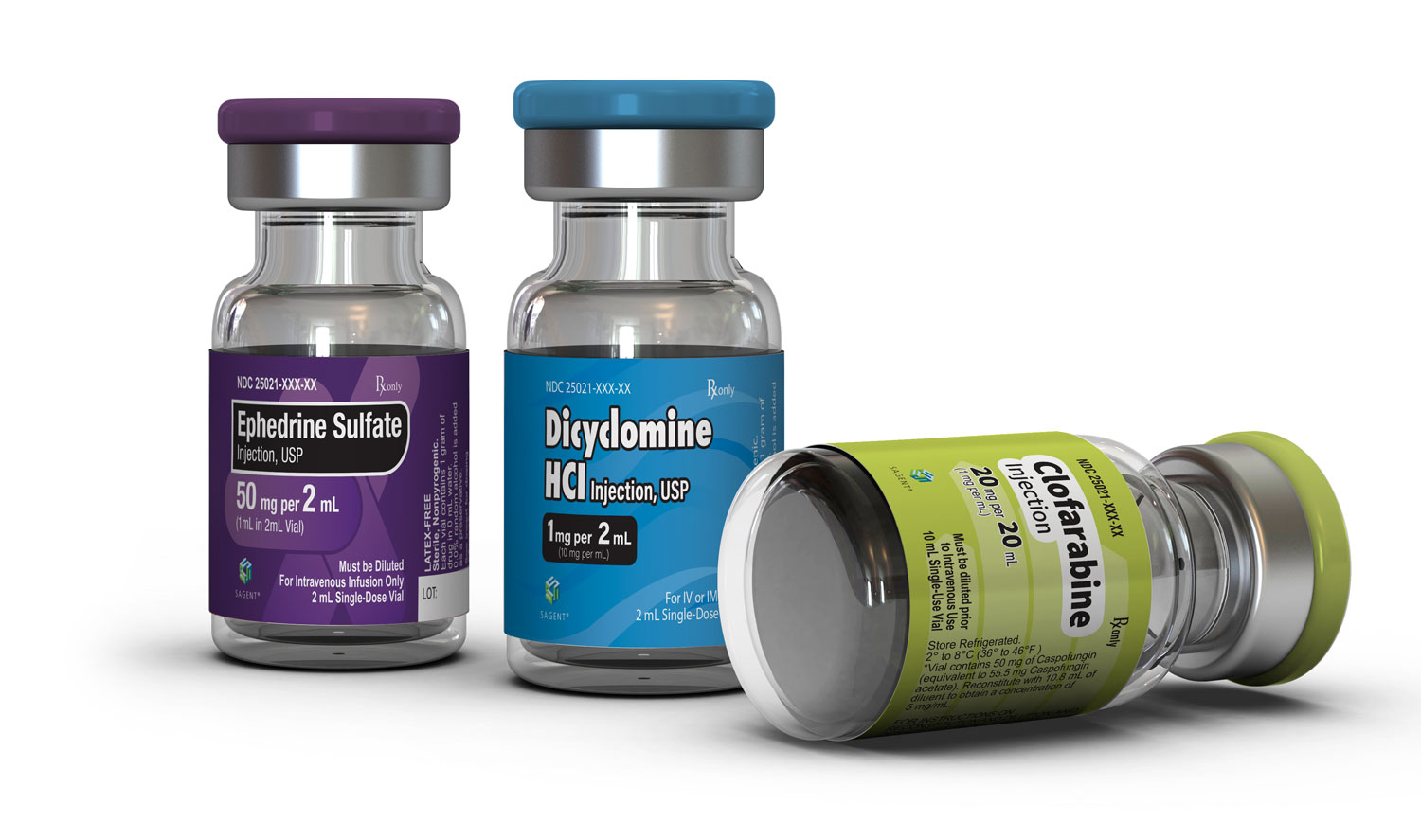
While packaging design often leans on consistency and cohesion, the challenge for Sagent Pharmaceuticals required an entirely different approach. I was brought in to design packaging for a series of injectable treatments—ranging across vaccines, IV drugs, and other hospital-use pharmaceuticals.
The core objective? Ensure visual distinction between each treatment at a glance. Rather than building a unified packaging system, the work demanded the creation of unique, non-overlapping label designs. The goal was to reduce the potential for medication errors by making every vial and box instantly recognizable—whether on a shelf, in a tray, or in clinical storage.
What We Did
Pharmaceutical Package Design
Typographic Systems
Visual Differentiation Strategy
Color Theory & Application
Layout Design for Small Formats
Pattern & Graphic Treatments
Print-Ready Production Files
Platforms Used
Adobe Illustrator
Constraints & Strategy
Each treatment required thoughtful and deliberate design direction. I explored unique typographic pairings, color combinations, and in some cases, pattern overlays or subtle gradients to build clear visual separation between products.
Importantly, certain colors were already “reserved” for specific drug families—so any design exploration had to take into account existing associations and avoid overlap with prior or parallel products in Sagent’s catalog. All of this was done while ensuring layouts met FDA guidelines for medical labeling.
Visual Clarity Through Contrast
Clarity wasn’t just about color—it was also about pacing, contrast, and structure. In each design, white space played a critical role in improving legibility, allowing the eye to easily scan important information like drug names, dosages, and usage instructions. Paired with bold color-coding and typographic hierarchy, the end result supported quick, confident identification in high-pressure clinical settings.
Systematic Variation
This process demanded more discipline than freedom. With each new label, I had to avoid reusing elements across treatments, all while staying within Sagent’s broader visual language. The result was a tightrope walk between individuality and cohesion—a unique challenge that required creative restraint and close attention to nuance.
Let’s Work Together
Pexl works with companies like yours to create memorable brands and websites that drastically improve your key performance indicators, allowing you to display your brand proudly.